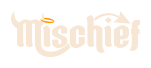
As a subbrand of Nobo, a cannabis dispensary, Mischief needed a more cohesive and recognizable visual identity that could stand out across an increasingly wide range of customer touchpoints. ThrivePOP refreshed the wordmark, color palette, typography, and overall brand style, creating a unified identity that retained Mischief's distinctive personality.
From packaging and billboards to event graphics, merchandise, and ongoing digital campaigns, we brought the refreshed brand to life across every part of its marketing.
The Challenge
Mischief had an established personality, but its visual identity needed a more cohesive direction. The goal was to create a recognizable brand system that could carry consistently across packaging, advertising, promotional materials, and digital communications.
As a subbrand of Nobo, Mischief needed to maintain its own identity while giving the team a flexible visual foundation for ongoing marketing.
Solution
ThrivePOP updated Mischief's wordmark and refined its visual identity through a refreshed color palette, typography, and cohesive brand style. Together, these elements created a more unified look that could translate across different formats while preserving the brand's distinctive character.
We also refreshed the supporting mascot illustration and developed additional graphic assets, expanding the creative toolkit available for campaigns, packaging, merchandise, and promotions.
“One of the best brandings at the whole competition.”
"The refreshed Mischief branding made a strong impression at Minnesota’s Legacy Cup. People were taking pictures with the Mischief character, the tablecloth received great feedback, and the branding was called one of the best at the competition.
Working with ThrivePOP has been a great experience. The team understands our vision, the end result reflects it, and communication is 10 out of 10. The collaboration is so smooth that sometimes it feels like we all work for the same company."
At the heart of the refresh was a more cohesive visual system. ThrivePOP updated Mischief's wordmark and established a refreshed palette, typography, and brand style to create a distinct look that could be applied consistently across channels.
The result was a more unified identity, giving Mischief a recognizable foundation that worked across everything from small-format packaging to large-scale advertising.
Bringing the Brand to Life
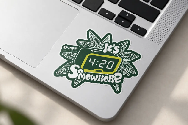
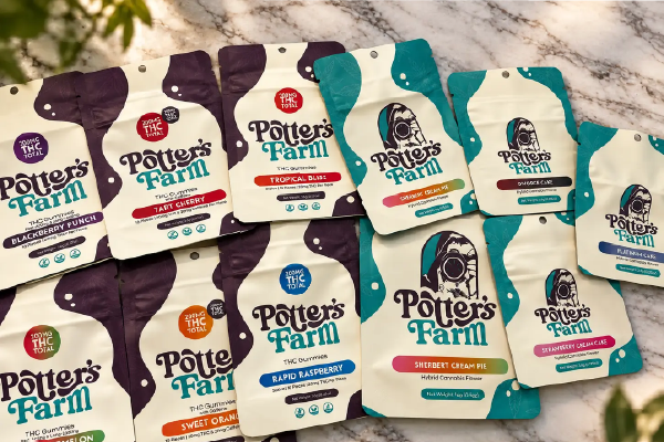
With the refreshed identity established, ThrivePOP carried Mischief's new look into the real world. Product packaging, billboards, event graphics, print materials, and merchandise all became opportunities to reinforce the brand through consistent visual design.
Each application brought the identity into a different setting while maintaining a recognizable connection to the larger brand.
A Flexible System for Ongoing Marketing
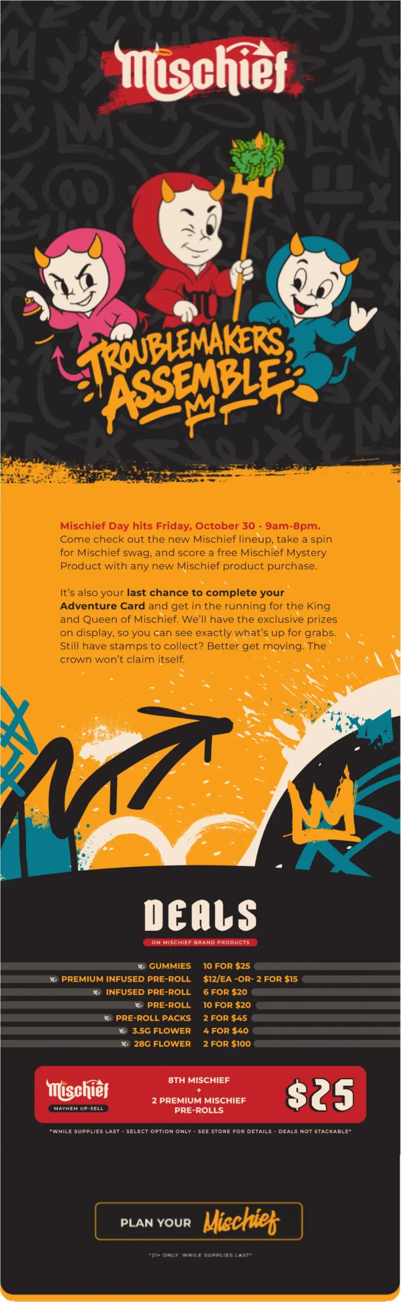
ThrivePOP extended Mischief's refreshed identity into email marketing, text messaging, and ongoing promotional campaigns. The updated visual system and supporting graphic assets gave the team more flexibility to develop creative for different messages and formats without losing brand consistency.
From major campaigns to everyday communications, Mischief could maintain a unified presence while continuing to express its personality.