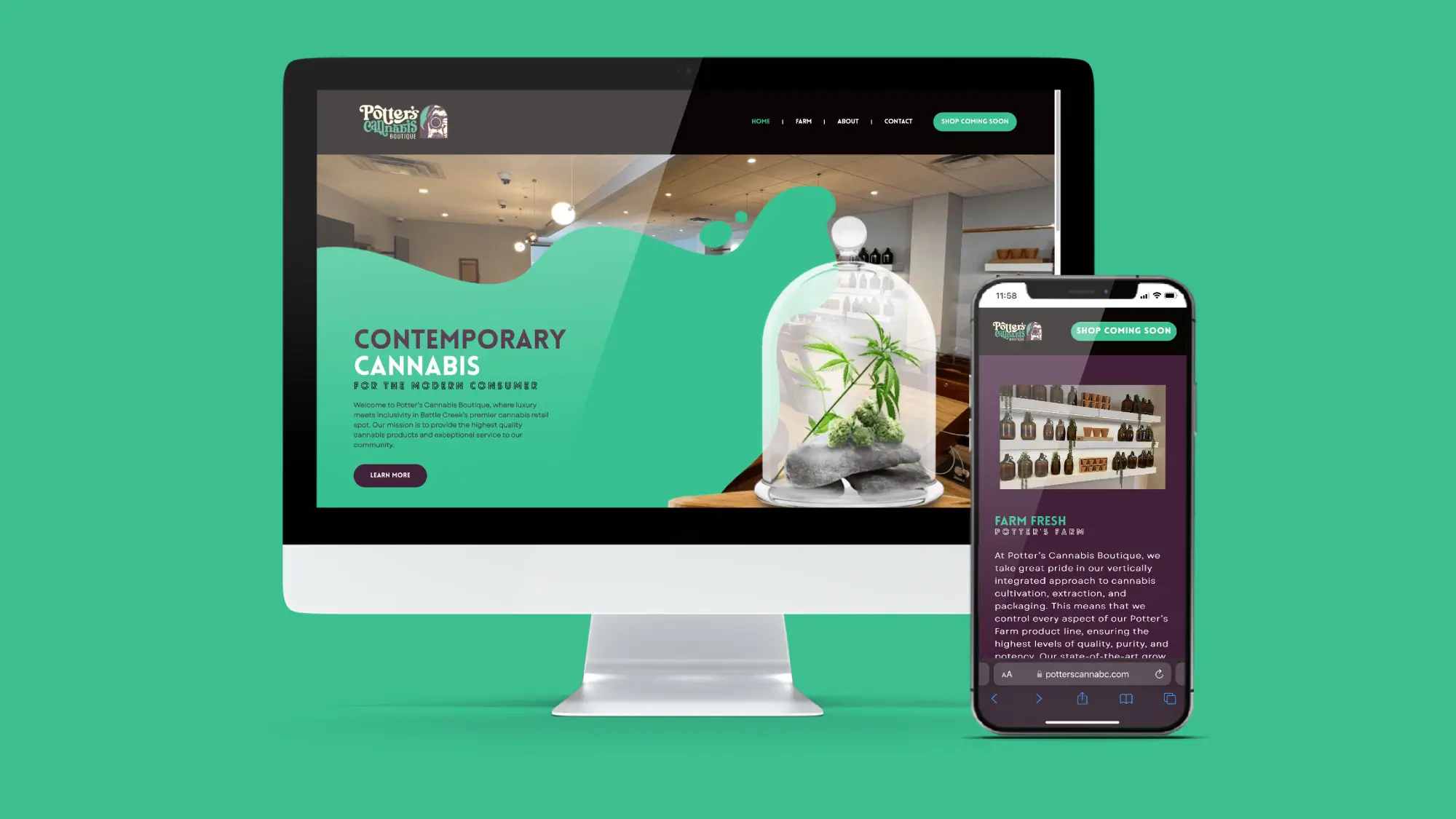
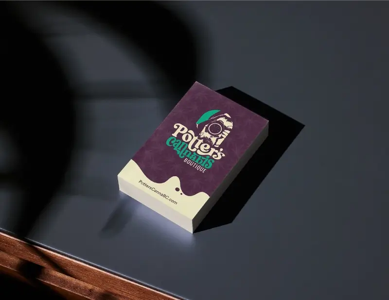
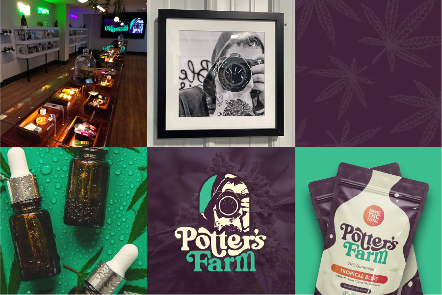
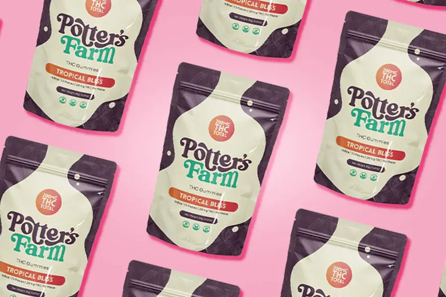
Potter's Cannabis

Branding, Email Marketing, Print, Social Media, Web Development
Potters cannabis website

How Potters Cannabis Boutique & Farm Launched Their New Brand for Dispensary and Cannabis Farm.

Challenge

Potters Cannabis Boutique and Farm launched their new brand, opened a dispensary, and needed a logo, a website, a social media presence, and a marketing strategy.

Results

The Go-To Market Strategy for Potter's Cannabis was able to establish the brand, website, product package, t-shirt design, integration between Spring Big and Dutchie, Event Marketing, and consistent social media following.

Key Products

Website, Marketing Strategy, SpringBig, Social Media, SEO, Branding, Showroom Design

Increase in Web Traffic
Active Users
Kimberly Ross Testimonial

What sets ThrivePOP apart is that everyone we have worked with is so down-to-earth, understanding, hardworking, and knowledgeable.

Kimberly Ross
Executive, Potter's Cannabis Boutique
Potter's Cannabis Business cards
About Potter's Cannabis

Potter Cannabis Farm & Boutique is a family-owned dispensary in Battle Creek, MI, founded and operated by Corey Potter. With over 15 years of cannabis cultivation experience, Corey established the business to share the positive benefits of cannabis and to honor the legacy of his late son, Jalen, who was his first partner in the venture. The boutique stands out for its commitment to quality, growing premium cannabis locally on its own farm, and offering personalized consultations in a welcoming, community-focused environment. Driven by Corey’s dedication and values of warmth, generosity, and service, Potter Cannabis is devoted to educating customers, supporting the local community, and providing exceptional products and care to everyone who walks through its doors

The Challenge

Potter’s Cannabis Boutique wanted to create a brand identity that would meaningfully honor Jalen Potter, the late son of owner Corey Potter, by incorporating both his likeness and his passion for photography into the logo. The challenge was to design a logo that captured Jalen’s spirit in a way that felt personal and authentic, but was also versatile enough to work seamlessly across all platforms and applications. This was not easily achieved when working with a detailed portrait.

The Solution
Creative Approach

To honor Jalen Potter’s legacy and his passion for photography, we designed a logo that features a stylized illustration based on a well-known self-portrait of Jalen holding his camera12. The camera lens serves as a central, memorable element within the logo, capturing both his spirit and the story behind Potter’s Cannabis Boutique. This solution allowed us to create a brand identity that is both deeply personal and visually distinctive, resonating with the community and providing a strong symbol for the business.

Logo Design:

The final logo, as shown above, combines expressive, organic typography with the unique portrait-in-lens graphic. This integration ensures the brand stands out while remaining versatile for use across digital platforms, merchandise, and signage.

Brand Colors:

Deep Purple – A rich, earthy purple that conveys sophistication and depth, serving as a foundational color throughout the brand.

Vibrant Green – A fresh, lively green used to evoke growth, wellness, and the natural qualities of the cannabis plant.

Soft Cream- A gentle, creamy tone that adds warmth and approachability, balancing the palette and creating a welcoming atmosphere.

Typeface:

The logo and headlines use the bold, eye-catching Lovelo/Lovelo Line typeface, while body copy is set in the clean, modern Garet font for readability and consistency.

By thoughtfully combining these elements, we delivered a cohesive and meaningful brand identity that celebrates Jalen’s memory and sets Potter’s Cannabis Boutique apart in the marketplace.

Potter's-Cannabis-Packaging
The Results

A meaningful and emotionally resonant brand identity that honors Jalen Potter’s legacy and creates a strong emotional connection with the local community.

Positive feedback from customers, family, and community members, who recognize and appreciate the thoughtful tribute woven into the logo and branding.

A cohesive visual foundation that supports future marketing efforts across packaging, signage, merchandise, and digital platforms.

Clear brand positioning that differentiates Potter Cannabis Boutique in a crowded market through authenticity, storytelling, and locally rooted values.

Enhanced customer experience, with the welcoming color palette and personalized visuals aligning with the boutique’s mission of education and care.

Ready To
Grow Like Them?

From strategy to creativity and data-driven results, we customize every campaign for your success—because one-size-fits-all just isn’t our style.